What are the Differences Between “Bleed,” “Trim” and “Safe Area” in Print Ads?
When you design an ad destined to be printed in a magazine, you want all the important text and images to appear. Understanding bleed, trim and safe area ensures that your important information will be placed correctly within your print ad.
Trim
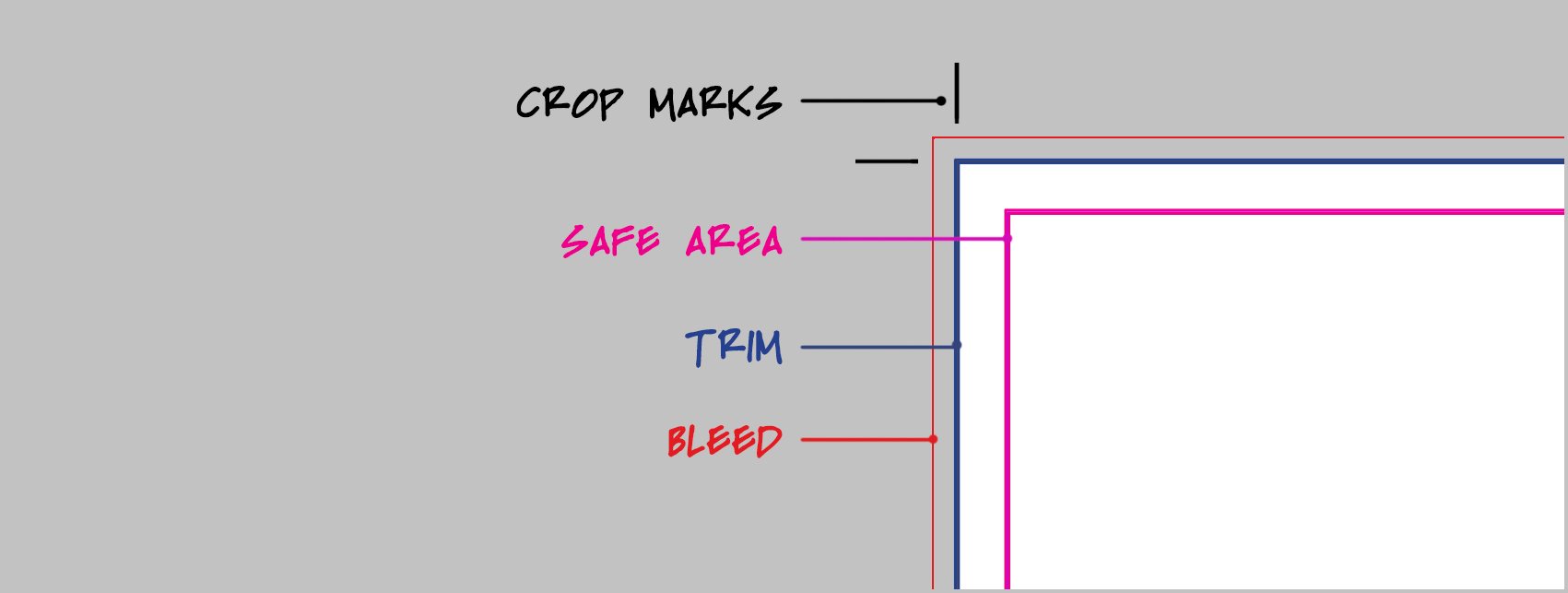
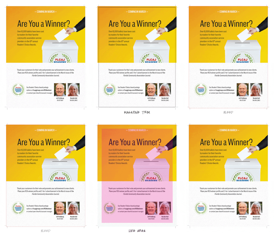
Trim size represents the final dimensions of your ad. For full page ads, this is also the size of the publication. However, artwork and photographs must extend beyond the trim size (see “bleed” below) to avoid narrow slivers of white at the edge of your ad once it is cut to size. When ads are prepared by your graphic designer, small lines in the upper and lower corners called “crop marks” indicate where an ad is to be trimmed. Trim size in FLCAJ magazine is 8.375″ x 10.875″.
Safe Area (Live Area)
This is an area inside the trim. Safe area (also known as live area) is a smaller dimension than your final ad size and is important to pay attention to because this is where you should place your most important information within your design. Any content outside of this area is in risk of being cut off! Safe area in FLCAJ magazine is .25″ inside trim.
The safe area can also account for the gutter, or middle, of the publication and how easy it will be to see content in the center of a magazine spread.
Bleed
Bleed is the portion of your design that extends past the trim size. Bleed is cut off when the publication is trimmed to the final size. Its sole purpose is to make sure your design or image reaches the very edge without leaving any unsightly white edges. Bleed in FLCAJ magazine is .125″ larger than the trim on all 4 sides (8.625″ x 11.125″)
